.svg)


What Alpine Bike Hire Websites Reveal About Booking Usability
Our UX specialists are spending the summer looking at bike hire websites across the Alps to understand what makes booking simple for riders and where small improvements could make a big difference.

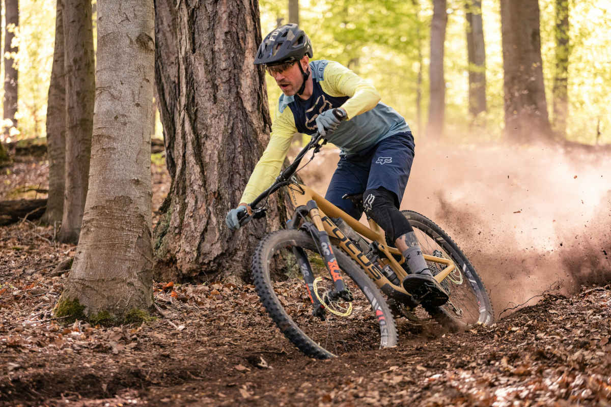
We're spending the summer looking at bike hire websites across the Alps to understand what makes booking simple for riders and where small improvements could make a big difference.
The Alps deserve world-class websites too.
Morzine. Les arcs. Tignes. Saalbach.
Some of the best mountain biking in the world.
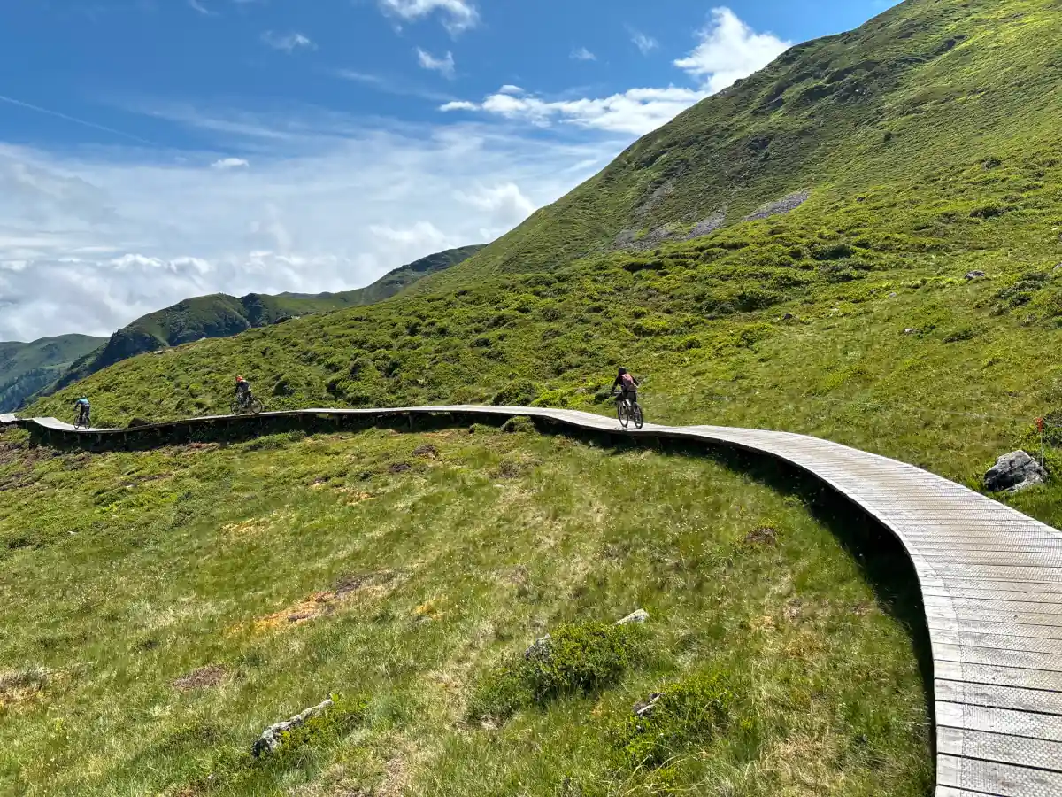
The quality of the trails is exceptional. The bikes are incredible. The people running the hire shops are passionate riders who genuinely care about giving customers a great experience.
So this article isn't about criticising businesses.
It's about sharing ideas.
Over the past few weeks we've been looking at bike hire websites from a rider's perspective, exploring what helps customers book with confidence and identifying small improvements that could make the online experience even better.
After all, when someone is spending several hundred euros hiring bikes for a family holiday, the website is often their first interaction with your business.
Looking Through a Rider's Eyes
Rather than reviewing websites as UX designers, we imagined a familiar scenario.
Geneva’s just landed in Geneva.
You've driven to Morzine.
Tomorrow morning you're riding.
You've got your phone in your hand and one simple goal.
Find the right bike.
Within a minute you're probably asking yourself:
- Which bike suits the riding I'm planning?
- Can I compare my options?
- What's included?
- Is it available?
- Can I trust this business?
The easier a website answers those questions, the easier it becomes to complete a booking.
Principle One
Help Riders Choose Before Asking Them to Book
One of the most common patterns we've noticed is that websites often encourage visitors to start booking before helping them choose a bike.
Large Reserve Now buttons are great.
But riders often need confidence before commitment.
Imagine walking into a bike shop.
The mechanic probably wouldn't ask for your hire dates before asking what sort of riding you're planning.
Your website should work the same way.
Before asking someone to book, help them choose.
Quick win
Feature three or four popular bike types on your homepage (such as downhill, enduro, ebike, cross country )
Include:
- Large photography
- Daily price
- Rider ability
- "Perfect for..." description
- Book Now button
Suddenly the booking process feels much more natural.
Principle Two
Sell the Ride, Not Just the Rental
People don't travel to Morzine simply to hire a bike. They're hiring an experience.The excitement starts long before they arrive.
Good photography can play a huge role in building that excitement. Not just studio images. Many websites already have fantastic bikes in their fleet. The opportunity is simply to showcase them more effectively. Show visitors why they'll love riding them.
Great example
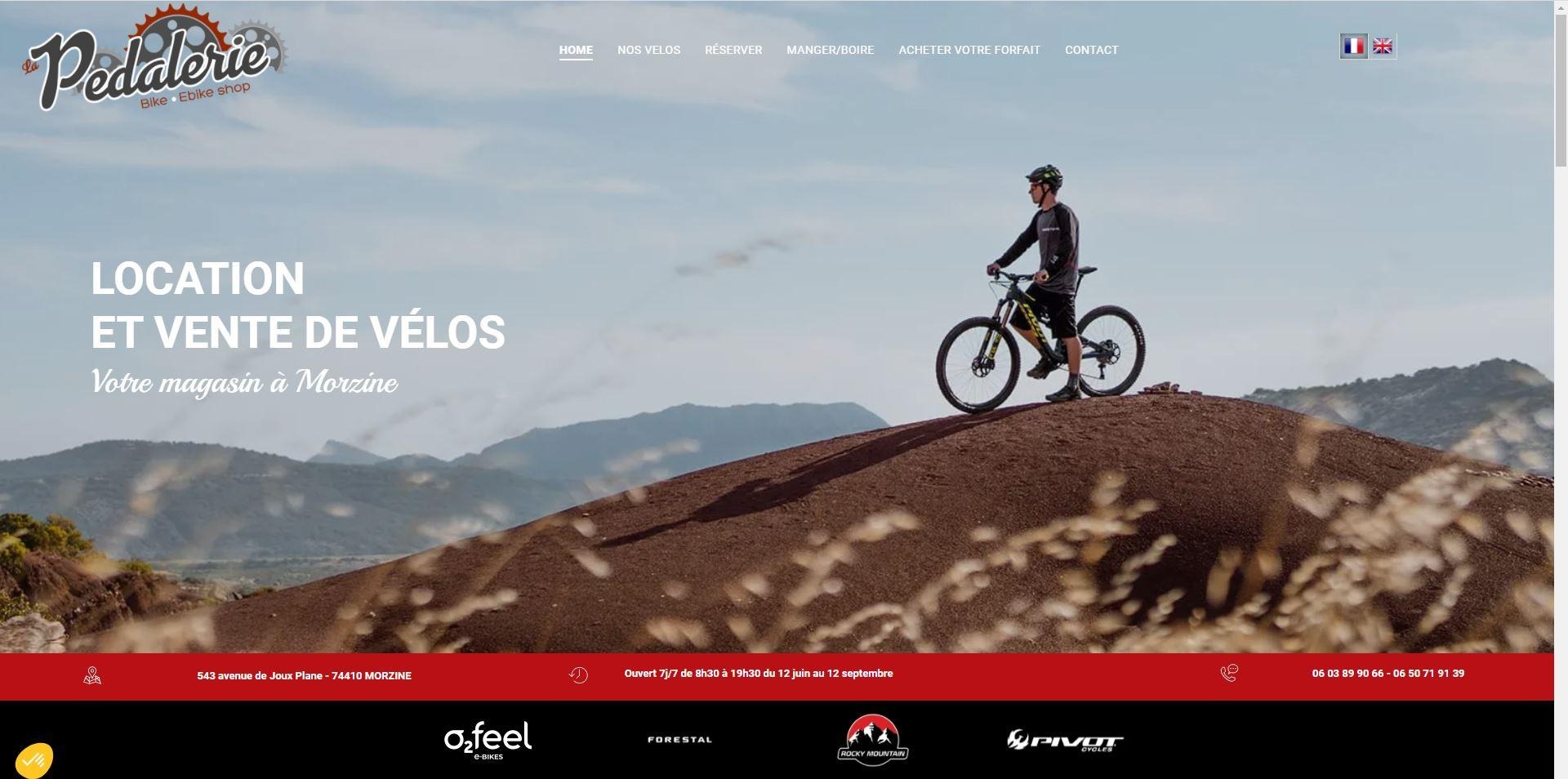
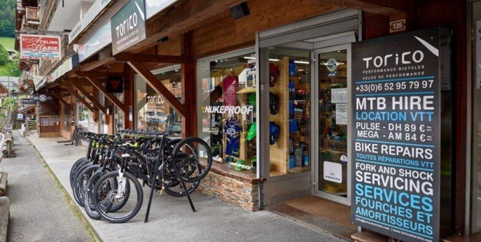
Some bike hire businesses do a great job of introducing riders to their fleet before asking them to book.
For example:
- Bike Morzine explains bike categories clearly and answers common questions before the booking process begins.
- Torico Morzine helps riders understand the difference between downhill, enduro and e-bikes, making it easier to choose the right bike.
Neither relies on technical jargon.
They simply help riders feel confident.
Principle Three
Reduce Uncertainty
The biggest barrier to online bookings often isn't price.
It's uncertainty.
Visitors hesitate when they don't know:
- What's included?
- Are helmets available?
- Is insurance included?
- What happens if it rains?
- Is this bike suitable for Bike Park laps?
- What's the cancellation policy?
Every answer removes another reason not to book.
Think of your website as your most experienced member of staff.
If customers regularly ask the same questions in store, answer them online first.
Principle Four
Navigation Should Feel Effortless
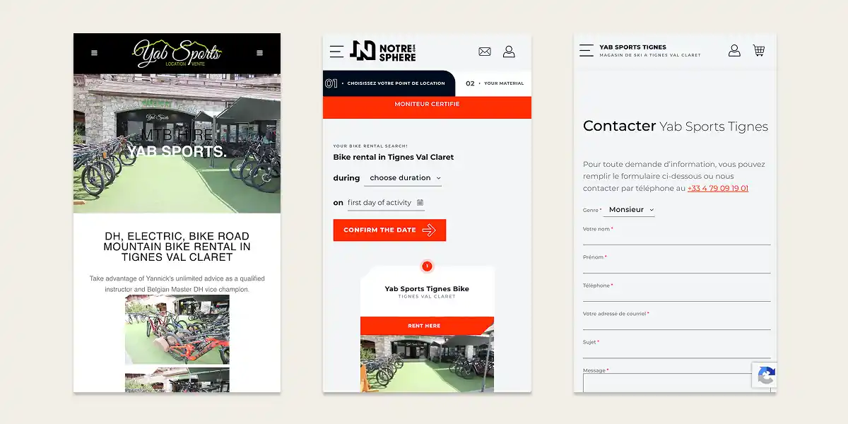
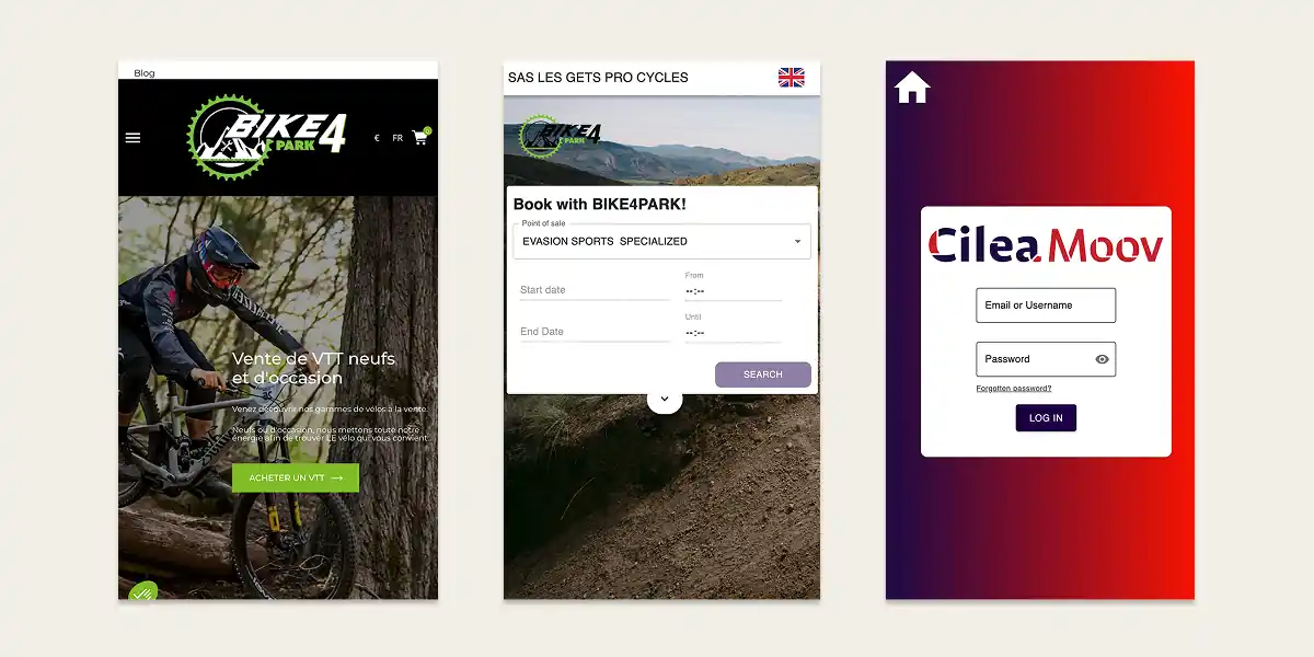
A simple navigation decision becomes surprisingly difficult when two menu icons appear together. Small interface choices like this can create unnecessary hesitation on mobile.
Customers shouldn't have to think about how your website works.
Their attention should stay focused on planning an amazing day's riding.
Principle Five
Build Trust Before Checkout
Hiring bikes online often involves spending hundreds of euros.
Especially for families or larger groups.
Before customers part with their money they naturally look for reassurance.
Simple additions such as:
- Google Reviews
- Workshop photography
- Team photos
- Collection information
- Maintenance processes
- FAQs
all help reinforce confidence.
Trust isn't built at checkout.
It's built throughout the journey.
Alpine Bike Hire Directory
Planning a mountain biking trip? We've pulled together some of the best-known bike hire shops across the Alps. Whether you're looking for downhill bikes, enduro bikes or eMTBs, these are a good place to start your search.
Know a great shop we've missed? Let us know and we'll keep this guide updated.
Five Improvements Any Bike Hire Website Can Make
Small improvements often have the biggest impact. You don't need a complete redesign to improve your booking experience.
Start with these five ideas.
✅ Show your bikes before your booking engine.
✅ Add "Perfect for..." descriptions to every bike.
✅ Explain the difference between bike categories.
✅ Display reviews close to booking buttons.
✅ Answer your most common customer questions before checkout.
Design a user journey to increase booking ease
Traditional Bike Hire Journey
Most bike hire websites follow a similar booking process, asking users to select dates, choose a bike category and then filter by price or brand. While familiar, this often requires customers to make several decisions before they have enough information to choose confidently.
For less experienced riders, this can create unnecessary friction and increase the likelihood of abandoning the booking process.
Key findings
- Familiar but product-led journey
- Too many decisions too early
- Can increase user frustration
- Risk of lower conversion rates
A More User Centred Journey
A simpler approach starts with the rider’s goal rather than the bike category. Asking what type of riding the customer plans to do allows the website to recommend suitable bikes before offering filters to refine the results.
This creates a more intuitive experience that is easier for both beginners and experienced riders.
Key findings
- Starts with user intent
- Reduces decision fatigue
- More relevant recommendations
- Easier and faster to book
Our UX Recommendation
The biggest opportunity is to simplify the early stages of the booking journey. Small improvements to navigation, filtering and page structure can make the experience feel significantly easier without requiring a complete redesign.
Helping customers find the right bike should always take priority over presenting every available option upfront.
Key findings
- Simplify early decisions
- Design around customer goals
- Improve clarity and navigation
- Small UX changes can improve conversions
Our Choice: Mathias Sport, Morzine
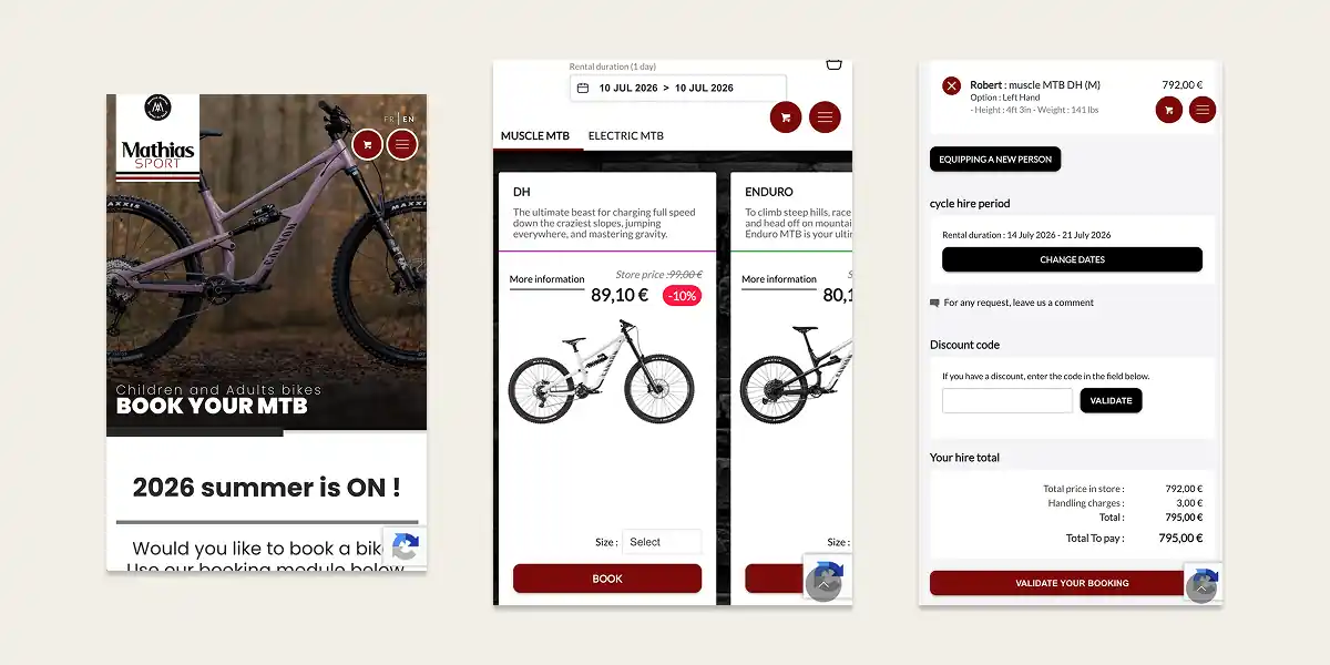
Mathias Sport is a strong example of how a bike rental page can feel simple, confident and easy to use. It does not try too hard, which is exactly why it works. The booking journey is clear, the page feels calm, and users can quickly understand how to check availability and reserve a bike.
What we like most is that the booking experience is given proper priority. There is not a wall of content, mixed messages or too many competing options before the user gets started. The page knows what most visitors are there to do: find a bike, check dates and make a booking.
It is not perfect, but it is a good benchmark for other rental businesses. The next step would be to make the journey even more helpful by asking riders what kind of riding they are planning, then recommending suitable bikes. That would make the experience easier for holiday riders, beginners and anyone who does not know the difference between Enduro, Downhill, E-bike or Cross Country.
Why We Like It
- Booking is easy to find
- The page feels calm and uncluttered
- Users are not overwhelmed too early
- The journey feels practical rather than overdesigned
- It gives visitors confidence to keep moving
Higher Ground Recommendation
Build on this approach with a more guided bike finder. Start with the rider’s goal, then show the most suitable bikes based on how and where they want to ride.
Final Thoughts
The purpose of this series isn't to judge websites.
It's to celebrate an industry that already delivers incredible riding experiences and share practical ideas that could help more visitors discover them.
We'll continue exploring bike hire websites throughout the Alps over the coming months, highlighting good ideas, useful patterns and practical improvements that any business can adopt.
Because better booking experiences don't just benefit businesses.
They help more people get out on the trails.
Enjoyed this article?
If you run a bike hire business and would like a friendly second opinion on your website by our CRO & UX specialists, we'd be happy to record a free 10-minute video review highlighting a few practical improvements.
No jargon.
No obligation.
Just honest, constructive feedback from riders who also happen to specialise in improving online booking experiences.