What could cause a low conversion rate on a website?
Explore the various elements that shape user behaviour and contribute to disappointing conversion rates.

One of the main problems we find in the world of conversion rate optimisation (CRO) is that companies often fail to engage their audiences properly, then wonder why exactly they aren't getting any leads, let alone some leads. But what are some of the aspects that could cause a low conversion rate? and what can you do about it? This article should help.
Don’t panic! We’re here to help with invaluable Conversion Rate Optimisation tips to help. We're going to cover:
- What can you do if your website doesn’t convert (m)any leads?
- What if the leads you receive aren’t the kind you really need?
- What’s the best approach to fixing these conversion rate issues?
Poor User Experience (UX)
Navigation Issues
Complicated or confusing navigation can frustrate users and discourage them from completing desired actions. To enhance website navigation, focus on a clear and consistent menu design with concise labels, organise content logically through meaningful categories, and ensure mobile-friendly and responsive design. Use descriptive page titles, implement breadcrumbs for hierarchical clarity, and include a search bar with predictive text.
Slow Loading Times
If your website takes too long to load, users may abandon it before reaching the conversion point.
Loading times are massive contributors to low conversion rates. It's estimated that for every second your page loads negatively affects conversion rates by up to 7% each second! If you need help with speeding up your website please get in touch.
You can check the loading speed of your landing page using Google Page Speed insights
Unclear Call-to-Action (CTA)
If users are unsure about what action to take next or if the CTA is not prominent, they may not proceed with the conversion. But call to actions need to be relevant! This is where UX design plays a vital role.
Ineffective Landing Pages
Landing pages can cover anything from booking an event to reading about tooth whitening. Landing pages should be relevant, compelling, and match user expectations. If they don't provide the information users are looking for, your conversion rates will suffer.
Lack of Trust
Users may hesitate to convert if they don't trust your website. This can be influenced by factors like poor design, lack of contact information, or an unprofessional appearance. This is where branding and UX design can help.
Technical Issues
Broken links, forms that don't work, or other technical glitches can impede the conversion process and frustrate users.
Inadequate Content
If your content doesn't address user needs or lacks quality, users may not find value in your offerings, leading to a low conversion rate.
Mismatched Audience
Targeting the wrong audience can result in visitors who are not interested in your products or services, leading to low conversion rates.
Here at Higher Ground we run sales strategy workshops that help connect the customers with your offerings.
Competitive Pricing and Offers
If your competitors offer better prices, promotions, or value, users may choose to convert on their websites instead.
Mobile Responsiveness
With the increasing use of mobile devices, a website that is not optimized for mobile can drive away potential conversions.
Lack of Social Proof
Testimonials, reviews, and case studies can build trust and credibility. Without these elements, users may be hesitant to convert.
Complicated Checkout Process
If the checkout process is too complicated or requires too many steps, users may abandon their carts before completing a purchase.
Ineffective Marketing Strategies
If your marketing channels are not targeting the right audience or if the messaging is not resonating with users, it can lead to low conversion rates.
Seasonal or Industry Trends
External factors such as seasonal trends or changes in the industry can impact user behaviour and, subsequently, conversion rates.
To improve your conversion rate, it's essential to analyse user behaviour, conduct A/B testing, and continuously optimise your website based on the insights gained from the data.
Websites often miss out meaning and fail to connect with the audience they are trying to build a relationship with. A common mistake is to present content written from a company’s introspective point of view: “We do consulting” or “We offer training” - but not clearly explain how the customer will benefit. This is where value propositions come in useful.
Here are a few our tips to improve conversion rates
Understanding the value proposition
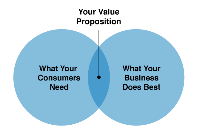
Value propositions have enormous potential to help your business attract customers and increase conversions, but only when they are written effectively.
If you’ve never heard of value propositions, they are like elevator pitches:
- clear,
- concise and
- convincing
descriptions of how you would best meet a person’s needs; delivered in the shortest time it would take to share an elevator and an idea with a prospective customer. The best value propositions directly address a specific need experienced by your ideal customer. A great value proposition should also emphasise the individual qualities that separate and elevate your business above its competition.
You should make landing pages for each of your value propositions. This means that each landing page should highlight a
- different,
- unique and
- specific
benefit to the customer, and include relevant calls to action. Most importantly, for your value proposition to be effective - for it to be understood instantly - you must have a detailed understanding of your customers’ needs. A strong, instantly recognisable value proposition can make or break businesses operating in competitive markets and niche marketing industries, so it’s essential that you make it the cornerstone of your overall marketing strategy.

Until you know what your value proposition is, and how to capitalise on it, your business will be just another voice in the digital crowd.
Be laser focused on your goals
A cool site packed with the latest features can be good for appearances, but if it doesn’t help your users purchase, then it’s only serving your company and not your customer. To compete today, you need to be laser-focused on discovering and aligning your website to the goals of your consumers. If you don’t they’ll find someone else who will. Following the latest design trends won’t get you very far. Following your customers’ goals will.

Be informed. Use available data
The two most frequent problems here are that you aren’t tracking your website activity at all or you’re simply not reviewing your results. Many businesses know they should be measuring data, but have no idea what to look at, what to take away or how to harness the information gained.
Start with your goals. What is your objective as a business and what counts as a win? Now work backwards and identify other key metrics and tactics that will help you reach that objective. Check your data regularly to see what’s working and what isn’t, so you can adjust and fine-tune your efforts as you move forward.
Be considerate. Show empathy
Too many businesses build their websites using outdated marketing methodologies. They see their website as a one-way advert, rather than a two-way conduit for communication and connection. Power is truly in the hands of customers. If you don’t show deep understanding of their needs in the first moments on your site, they are far more likely to lose interest, disengage and look elsewhere.
Be less complex. Keep it simple
Every page on your website should have a single clear goal.
If you have more than one main clear call-to-action on each page, you’re trying to do too much. Break complex pages into multiple pages that are simpler and easier to navigate.
Be accessible & easy to navigate
If your website’s navigation or pathways are unclear or confusing, your visitors will abandon your site. Easy to grasp website architecture, effective site search and clear content will make a big difference to your visitors.
One common and frustrating example of this is the homepage pop-up. Marketers seem to love them, yet research continues to show that visitors hate them. Why make your guests’ first impression an annoying one?
Be better. Test, improve & optimise
Implementing a continuous improvement cycle is key to taking your website from OK to WOW!. Today, there are a variety of tools to help you test the different dimensions of your website. We’re big fans of Hotjar, VWO, Optimizely, Google Analytics, and UserTesting.
Be clear. Ditch the jargon & connect
Your website visitors typically have two goals in mind when they land on your site: to research something or purchase something. If your branding or unclear jargon gets in the way of them getting what they want, they’ll go elsewhere.
Your website should focus on presenting easy-to-find-and-purchase products, helpful customer service and a positive customer experience.
Be direct & answer the questions
What are the common frustrations your visitors have when engaging with your website? Are you (un)intentionally avoiding, evading, confusing, misleading or obfuscating?
- Do they not fully understand details of your product or service?
- Do they want to know more about pricing, guarantees or rating?
- Do they want to see factual points of difference to competitors?
Make sure you address primary concerns clearly and directly. You can get a sense of these by using customer service methods, reviews, online chat, social media and user testing. Answer questions in your content, your descriptions, your FAQs and throughout your site.
Be more trustworthy. Develop trust
If your visitors don't know you, how are you going to earn their trust? You can use a variety of tactics to increase trust including reviews, testimonials, case studies, relevant PR mentions, and charity sponsorship.
Most of all, if you’re selling something online, it’s especially important to make sure you can demonstrate the security and trustworthiness of your website with trust icons.
Sector Specific Case Study:
XServices: Data management
Let’s take a fictional example from the data management sector to identify and explore some common reasons why websites may not convert:
The value proposition is not clear.
If I am a prospective buyer of services such as "data management" and I can't find anything on a specific site that tells me XServices offers the particular services I am looking for, I will look elsewhere There may be lots of content, but it is too vague and often too far down the user journey to convince me that they would meet my urgent and exacting needs.
Low traffic from people searching for services related to XServices offerings.
I’m far less likely to trust an unknown company with business critical matters if there’s scant evidence of pre-existing traffic having already been drawn to their services. This could be because their key word and key phrase choices have been poor; however this also indicates a poor understanding of their prospective customers’ prime needs and likely search criteria.
Calls to action are too few, too far down the page or non-existent.
Without a clear, focused call to action I am far more likely to abandon my user journey.
The user's attention is lost before reaching a lead generation form.
If I’ve already travelled a significant way down a page, bombarded by information en route, I’m less likely to stay until eventually asked to submit details on a LGF.
The wording for calls to action seem very specific and yet are still too vague in meaning.
"Want to minimise costly disruptions by helping your team find your assets faster?"
Might be better as "Get in touch with XServices about data and asset management".
As a potential customer I am unable to access any actual services anywhere on the site.
Navigation items are needed to help users get to services they can commission.
This relates to targeted keywords such as ¨data management¨ and ¨data location¨.
The case studies presented don't relate to specific services offered by the company.
Case studies don’t necessarily need to be comprehensive, but they do need to mention the core services provided, so other users in that sector can see what XServices provides.
So if I am an intended or targeted customer, it should be easy to see what XServices did for another company in my sector. I should be able to see what services were delivered and what difference or impact resulted. Only then can I form a clear picture of how XServices could help my company achieve similar results or solve problems shared across my sector.
This case study and the reasons for low or no site conversions aren’t exhaustive. They’re really just a starting point to help grow your business online. But small changes like these can make a big difference. If you take the time to improve in each of these key CRO areas, you’ll be well on your way to getting more conversions and successfully growing your business.
If you need any help with your website conversion rates, get in touch with Higher Ground CRO Agency today.


.svg)


